In the article, we will see how to recreate bootstrap’s flexbox grid with Tailwind’s CSS Grids. We will see how to create a 12 column grid, gutter space, responsive columns, and everything that can be done with bootstrap by using tailwind.
Bootstrap grid is powered by flexbox, it has a twelve column system, five default responsive tiers, and a mobile-first system.
Tailwind CSS grids are powered by CSS Grids, which technically can have however many columns, five responsive tiers, lots of gutter gap utilities and are easily customizable.
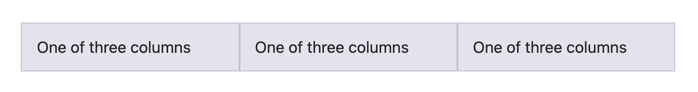
Let’s take the following bootstrap grid:
<div class="container">
  <div class="row">
    <div class="col-sm">One of three columns</div>
    <div class="col-sm">One of three columns</div>
    <div class="col-sm">One of three columns</div>
  </div>
</div>
This will get us three columns like this,
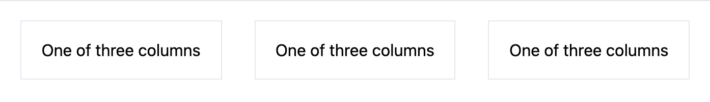
We can recreate the same on tailwind by using this,
<div class="grid grid-cols-3">
  <div>One of three columns</div>
  <div>One of three columns</div>
  <div>One of three columns</div>
</div>
We are using the CSS grid there and splitting it into three columns by using Grid Template Columns tailwind utility.
CSS Grids doesn’t have any gutter space built in like bootstrap grid, but we can add that by using the gap utility like this,
<div class="grid grid-cols-3 gap-8">
  <div>One of three columns</div>
  <div>One of three columns</div>
  <div>One of three columns</div>
</div>
Since these grid utilities are mobile-first by default, we have to add other cols utilities to make sure it looks good on mobile.
<div class="grid grid-cols-1 lg:grid-cols-3 gap-8">
  <div>One of three columns</div>
  <div>One of three columns</div>
  <div>One of three columns</div>
</div>
Here, on the lowest device-width, everything would be on one column and after it hits the lg breakpoint it would be three columns.
We have utility classes for up to 12 columns so we can have a 12 column layout like bootstrap.
The same responsive classes could be used for gap utilities also. The gutter gap below would increase after it hits the lg breakpoint. Like this,
<div class="grid grid-cols-1 lg:grid-cols-3 gap-4 lg:gap-8">
  <div>One of three columns</div>
  <div>One of three columns</div>
  <div>One of three columns</div>
</div>
But, what if you want to change individual column sizes? You can do that with Grid Column utilities.

<div class="grid grid-cols-1 lg:grid-cols-4">
  <div class="col-span-2">Takes two columns</div>
  <div>One of three columns</div>
  <div>One of three columns</div>
</div>
The above code uses grid column utility to make the first column take up two columns. And, this is also mobile first. So, if you want it to take up one column on mobile you can do the following,
<div class="grid grid-cols-1 lg:grid-cols-4">
  <div class="col-span-1 lg:col-span-2">Takes one column on mobile and two on desktop</div>
  <div>One of three columns</div>
  <div>One of three columns</div>
</div>
And that’s the easiest way to create a bootstrap like the grid in the tailwind.
Here is the final tailwind playground:
You can learn more about CSS grids here or learn by playing this interactive tutorial.
Up next
Skcript Create Week Skcript
https://blog.skcript.com/recreating-bootstrap-grid-with-tailwind-css-grids/
https://blog.skcript.com/svrmedia/heroes/recreating-bootstrap-grid-with-tailwind-css-grids-2x.jpg
Skcript
https://blog.skcript.com/recreating-bootstrap-grid-with-tailwind-css-grids/
https://blog.skcript.com/svrmedia/heroes/recreating-bootstrap-grid-with-tailwind-css-grids-2x.jpg